 Awesome Tricks And Best Practices From Kaggle
 Awesome Tricks And Best Practices From Kaggle
Easily learn what is only learned by hours of search and exploration.
By Bex T., Top Writer in AI
Weekly Awesome Tricks And Best Practices From Kaggle
About This Project
Kaggle is a wonderful place. It is a gold mine of knowledge for data scientists and ML engineers. There are not many platforms where you can find high-quality, efficient, reproducible, awesome codes brought by experts in the field all in the same place.
It has hosted 164+ competitions since its launch. These competitions attract experts and professionals from around the world to the platform. As a result, there are many high-quality notebooks and scripts on each competition and for the massive amount of open-source datasets Kaggle provides.
At the beginning of my data science journey, I would go to Kaggle to find datasets to practice my skills. Whenever I looked at other kernels I would be overwhelmed by the complexity of the code and immediately shy away.
But now, I find myself spending a considerable amount of time reading other’s notebooks and making submissions to competitions. Sometimes, there are pieces that are worth spending your entire weekend on. And sometimes, I find simple but deadly effective code tricks and best practices that can only be learned by watching other pros.
And the rest is simple, my OCD practically forces me to spill out every single piece of data science knowledge I have. So here I am, writing the first edition of my ‘Weekly Awesome Tricks And Best Practices From Kaggle’. Throughout the series, you will find me writing about anything that can be useful during a typical data science workflow including code shortcuts related to common libraries, best practices that are followed by top industry experts on Kaggle, and so on, all learned by me during the past week. Enjoy!
1. Plotting Only the Lower Part of Correlation Matrix
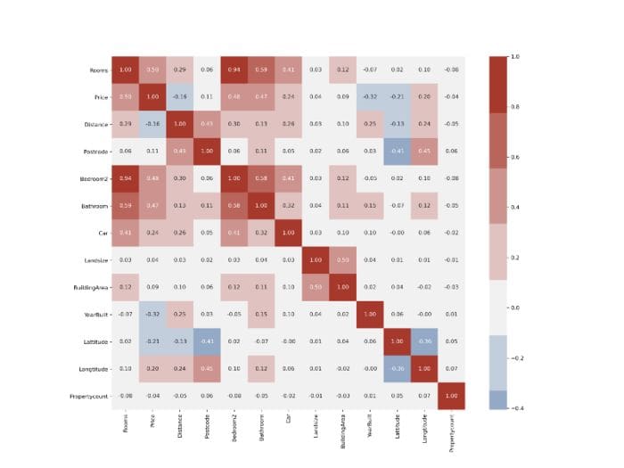
A good correlation matrix can say a lot about your dataset. It is common to plot it to see the pairwise correlation between your features and the target variable. According to your needs, you can decide which features to keep and feed into your ML algorithm.
But today, datasets contain so many features that it can be overwhelming to look at correlation matrices like this:

Weekly Awesome Tricks And Best Practices From Kaggle
However nice, there is just too much information to take in. Correlation matrices are mostly symmetrical along the main diagonal, so they contain duplicate data. Also, the diagonal itself is useless. Let’s see how we can plot only the useful half:
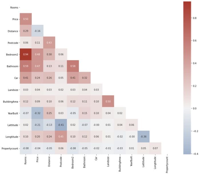
The resulting plot is much easier to interpret and free of distractions. First, we build the correlation matrix using the .corr method of the DataFrame. Then, we use np.ones_like function with dtype set to bool to create a matrix of True values with the same shape as our DataFrame:
Then, we pass it to Numpy’s .triu function which returns a 2D boolean mask that contains False values for the lower triangle of the matrix. Then, we can pass it to Seaborn’s heatmap function to subset the matrix according to this mask:
I also made a few additions to make the plot a bit nicer, like adding a custom color palette.
2. Include Missing Values in value_counts
A handy little trick with value_counts is that you can see the proportion of missing values in any column by setting dropna to False:
By determining the proportion of values that are missing, you can make a decision as to whether to drop or impute them. However, if you want to look at the proportion of missing values across all columns, value_counts is not the best option. Instead, you can do:
First, find the proportions by dividing the number of missing values by the length of the DataFrame. Then, you can filter out columns with 0%, i. e. only choose columns with missing values.
3. Using Pandas DataFrame Styler
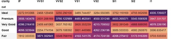
Many of us never realize the vast, untapped potential of pandas. An underrated and often overlooked feature of pandas is its ability to style its DataFrames. Using the .style attribute of pandas DataFrames, you can apply conditional designs and styles to them. As a first example, let’s see how you can change the background color depending on the value of each cell:

It is almost a heatmap without using Seaborn’s heatmap function. Here, we are counting each combination of diamond cut and clarity using pd.crosstab Using the .style.background_gradient with a color palette, you can easily spot which combinations occur the most. From the above DataFrame only, we can see that the majority of diamonds are of ideal cut and the largest combination is with the ‘VS2’ type of clarity.
We can even take this further by finding the average price of each diamond cut and clarity combination in crosstab:
This time, we are aggregating diamond prices for each cut and clarity combination. From the styled DataFrame, we can see that the most expensive diamonds have ‘VS2’ clarity or premium cut. But it would be better if we could display the aggregated prices by rounding them. We can change that with .style too:
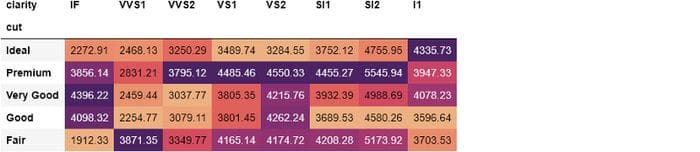
By chaining .format method with a format string {:.2f}, we are specifying a precision of 2 floating points.
With .style, your imagination is the limit. With a little bit of knowledge of CSS, you can build custom styling functions for your needs. Check out the official pandas guide for more information.
4. Configuring Global Plot Settings With Matplotlib
When doing EDA, you will find yourself keeping some settings of Matplotlib the same for all of your plots. For example, you might want to apply a custom palette for all plots, using bigger fonts for tick labels, changing the location of legends, using fixed figure sizes etc.
Specifying each custom change to plots can be a pretty boring, repetitive and time-consuming task. Fortunately, you can use Matplotlib’s rcParams to set global configs for your plots:
from matplotlib import rcParamsrcParams is just a plain-old Python dictionary containing default settings of Matplotlib:
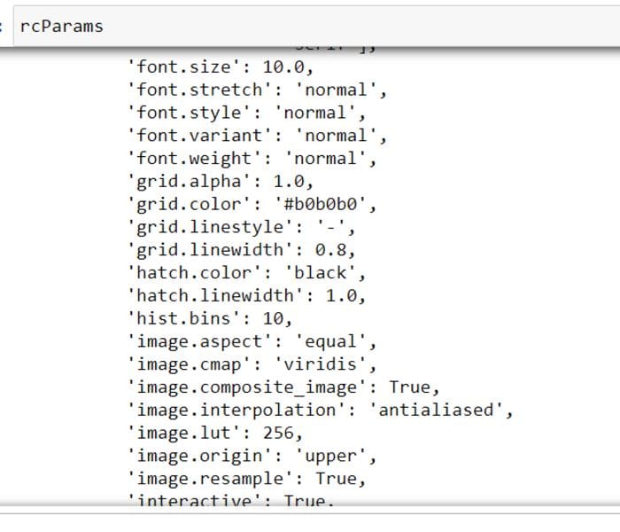
You can tweak pretty much every possible aspect of each individual plot. What I usually do and have seen others doing is set a fixed figure size, tick label font size, and a few others:
You can avoid a lot of repetition by setting these right after you import Matplotlib. See all the other available settings by calling rcParams.keys().
5. Configuring Global Settings of Pandas
Just like Matplotlib, pandas has global settings you can play around with. Of course, most of them are related to displaying options. The official user guide says that the entire options system of pandas can be controlled with 5 functions available directly from pandas namespace:
- get_option() / set_option() — get/set the value of a single option.
- reset_option() — reset one or more options to their default value.
- describe_option() — print the descriptions of one or more options.
- option_context() — execute a code block with a set of options that revert to prior settings after execution.
All options have case-insensitive names and are found using regex under the hood. You can use pd.get_option to see what is the default behavior and change it to your liking using set_option:
>>> pd.get_option(‘display.max_columns’)
20
For example, the above option controls the number of columns that are to be shown when there are many columns in a DataFrame. Today, the majority of datasets contain more than 20 variables and whenever you call .head or other display functions, pandas annoyingly puts ellipsis to truncate the result:
>>> houses.head()
I would rather see all columns by scrolling through. Let’s change this behavior:
>>> pd.set_option(‘display.max_columns’, None)Above, I completely remove the limit:
>>> houses.head()
You can revert back to the default setting with:
pd.reset_option(‘display.max_columns’)Just like columns, you can tweak the number of default rows shown. If you set display.max_rows to 5, you won’t have to call .head() all the time:
>>> pd.set_option(‘display.max_rows’, 5)>>> houses
Nowadays, plotly is becoming vastly popular, so it would be nice to set it as default plotting backed for pandas. By doing so, you will get interactive plotly diagrams whenever you call .plot on pandas DataFrames:
pd.set_option(‘plotting.backend’, ‘plotly’)Note that you need to have plotly installed to be able to do this.
If you don’t want to mess up default behavior or just want to change certain settings temporarily, you can use pd.option_context as a context manager. The temporary behavior change will only be applied to the code block that follows the statement. For example, if there are large numbers, pandas has an annoying habit of converting them to standard notation. You can avoid this temporarily by using:

You can see the list of available options in the official pandas user guide.
Bio: Bex T. is a Top Writer in AI, writing “I wish I found this earlier” posts about Data Science and Machine Learning.
Original. Reposted with permission.
Related:
- 8 Places for Data Professionals to Find Datasets
- 10 resources for data science self-study
- 10 Python Skills for Beginners