Visualising Geospatial data with Python using Folium
Folium is a powerful data visualization library in Python that was built primarily to help people visualize geospatial data. With Folium, one can create a map of any location in the world if its latitude and longitude values are known. This guide will help you get started.
By Parul Pandey

Data visualization is a broader term that describes any effort to help people understand the importance of data by placing it in a visual context. Patterns ,trends, and correlations can be easily shown visually which otherwise might go unnoticed in textual data. It is a fundamental part of the data scientist’s toolkit. Creating visualisations is pretty easy but creating good ones is much harder. It requires an eye for detail and good amount of expertise to create visualisations which are simple yet effective. Powerful visualisation tools and libraries are available today which have re defined the meaning of visualisation.
The beauty of using Python is that it offers libraries for every data visualisation need. One such library is Folium which comes in handy for visualising Geographic data (Geo data). Geographic data (Geo data) science is a subset of data science that deals with location-based data i.e. description of objects and their relationship in space.
Pre-requisites
This tutorial assumes basic knowledge of Python and Jupyter notebook, along with Pandas library.
Introduction to Folium
Folium is a powerful data visualisation library in Python that was built primarily to help people visualize geospatial data. With Folium, one can create a map of any location in the world as long as its latitude and longitude values are known. Also, the maps created by Folium are interactive in nature, so one can zoom in and out after the map is rendered, which is a super useful feature.
Folium builds on the data wrangling strengths of the Python ecosystem and the mapping strengths of the Leaflet.js library. The data is manipulated in Python and then visualised in a Leaflet map via folium.
Installation
Before being able to use Folium, one may need to install it on the system by any of the two methods below:
$ pip install folium
or
$ conda install -c conda-forge folium
The Dataset
Downloading the dataset
We’ll be working with the World Development Indicators Dataset which is an open dataset on Kaggle. We will be using the ‘indicators.csv’ file in the dataset.
Also, since we are dealing with geospatial maps, we also need the country coordinates for plotting. Download the file from here.
The file can also be downloaded from my github repo.
Exploring the data set
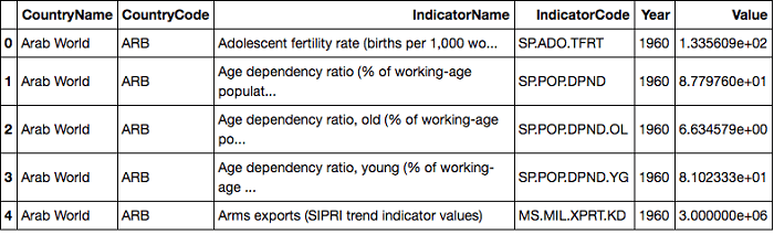
The World Development Indicators dataset is just a slightly modified version from the dataset that’s actually available from the World Bank. It contains over a thousand annual indicators of economic development from about 247 countries around the world from 1960 to 2015. Few of the Indicators are:
1. Adolescent fertility rate (births per 1,000 women)
2. CO2 emissions (metric tons per capita)
3. Merchandise exports by the reporting economy
4. Time required to build a warehouse (days)
5. Total tax rate (% of commercial profits)
6. Life expectancy at birth, female (years)
Getting started
- Jump over to the Jupyter Notebooks and import the required libraries. Make sure to create the jupyter notebook in the same folder as data for ease.
- Set up the country co-ordinates
- Read in the database and explore the database
Code:
import folium
import pandas as pd

country_geo = 'world-countries.json'

data = pd.read_csv('Indicators.csv')
data.shape

data.head()
We obtain the following. It seems that the indicators dataset have different indicators for different countries with the year and value of the indicator.
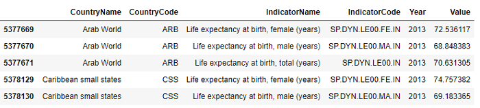
Life expectancy at birth, female (years) appears to be good indicator for investigation. So, let’s pull out the life expectancy data for all the countries in 2013. We are just choosing the year at random.
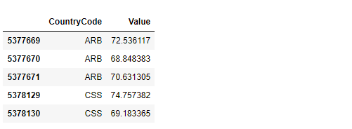
Also let us set up our data for plotting by keeping just the country code and the values that we’ve plotted. We’ll also want to extract the name of the indicatorfor use as the legend in the figure.
Code:
# select Life expectancy for females for all countries in 2013
hist_indicator =  'Life expectancy at birth'
hist_year = 2013

mask1 = data['IndicatorName'].str.contains(hist_indicator)
mask2 = data['Year'].isin([hist_year])

# apply our mask
stage = data[mask1 & mask2]
stage.head()

#Creating a data frame with just the country codes and the values we want plotted.
data_to_plot = stage[['CountryCode','Value']]
data_to_plot.head()

# labelling the legend
hist_indicator = stage.iloc[0]['IndicatorName']
Creating the Folium interactive map
Now we’re actually going to to create the Folium interactive map. We’ll create a map at a fairly high level of zoom. And then next, we’ll use the built-in method called choropleth to attach the country’s geographic json and the plot data.
Code:
# Setup a folium map at a high-level zoom
map = folium.Map(location=[100, 0], zoom_start=1.5)

# choropleth maps bind Pandas Data Frames and json geometries.
#This allows us to quickly visualize data combinations
map.choropleth(geo_data=country_geo, data=plot_data,
             columns=['CountryCode', 'Value'],
             key_on='feature.id',
             fill_color='YlGnBu', fill_opacity=0.7, line_opacity=0.2,
             legend_name=hist_indicator)
We also need to specify the relevant parameters. The ‘key on’ parameter refers to the label in the json object which has the country code as the feature ID attached to each country’s border information. This it the tie that we need to set up in our data. Our country code in the data frame should match the feature ID in the json object.
Next, we specify some of the aesthetics, like the color scheme, the opacity and then we label the legend.
The output of this plot is going to be saved as a html file which is actually interactive. So, what we’ll need to do is to save it and read it back into the notebook in order to interact with it on the map.
Code:
map.save('plot_data.html')
# Import the Folium interactive html file


from IPython.display import HTML
HTML('<iframe src=plot_data.html width=700 height=450></iframe>')
We will obtain a map like the one below:

And now we have our map. Notice first the dark colors imply higher life expectancy for females. Clearly US and majority of Europe have a higher life expectancy for females.
So, this is an example of how to do geographic overlays. It is also as an example of how to use additional visualization libraries and how they can be powerful depending on our visualization needs.
This was a pretty simple first step into the world of choropleth maps using Pandas dataframes and Folium. You can explore more about folium and the interactiveness it provides at the official documentation page.
To see the actual interactiveness of the map, visit the Github repo .
Related: