 PyViz: Simplifying the Data Visualisation Process in Python
 PyViz: Simplifying the Data Visualisation Process in Python
There are python libraries suitable for basic data visualizations but not for complicated ones, and there are libraries suitable only for complex visualizations. Is there a single library that handles both these tasks efficiently? The answer is yes. It's PyViz
By Parul Pandey, Data Science Enthusiast
The purpose of visualization is insight, not pictures.
―Ben Shneiderman
If you work with data, then Data Visualisation is a vital part of your daily routine. And if you use Python for your analysis, you ought to be overwhelmed by the sheer amount of choices present in form of Data Visualisation libraries. Some libraries like Matplotlib are used for initial basic exploration but are not so useful for showing complex relationships in data. There are some which work well with large datasets while there are still others which mainly focus on 3D renderings. In fact, there isn’t a single visualisation library which can be referred to as the best one. There are certain features in one that is better than the other and vice versa. In short, there are a lot of options and it is impossible to learn and try them all or maybe, get them all to work together. So how do we get our job done? PyViz may have an answer.
Python’s Current Visualisation Landscape
The existing Python Data Visualisation system appears to be a confusing Mesh.
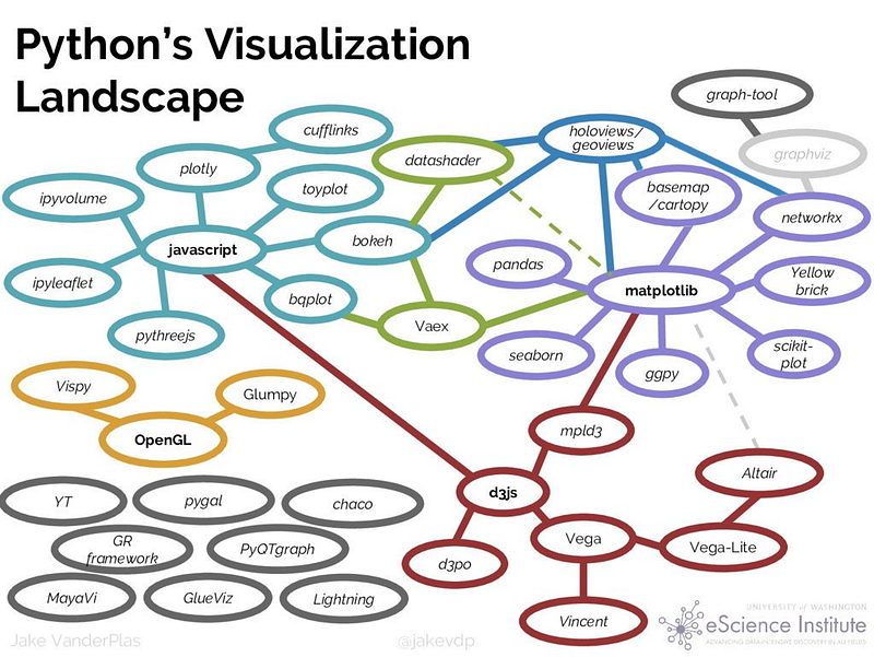
Now, to choose the best tool for our job from amongst all of these is a bit tricky and confusing. PyViz tries to plug this situation. It helps to streamline the process of working with small and large datasets (from a few points to billions) in a web browser, whether doing exploratory analysis, making simple widget-based tools or building full-featured dashboards.
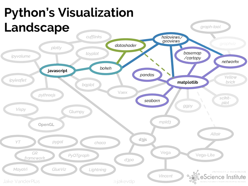
PyViz Ecosystem
PyViz is a coordinated effort to make data visualization in Python easier to use, learn and more powerful. PyViz consists of a set of open-source Python packages to work effortlessly with both small and large datasets right in the web browsers. PyViz is just the choice for something as simple as mere EDA or something as complex as creating a widget enabled dashboard.
Here is the Python’s visualisation landscape with PyViz.
PyViz Goals
Some of the important goals of Pyviz are:
- Emphasis should be on data of any size not coding
- Full functionality and interactivity should be available right in the browsers(not desktops)
- The focus should be more on people who are Python users and not web programmers.
- Again focus should be more on 2D viz more than 3D.
- Exploitation of general -purpose SciPy/PyData tools with which the Python users are already familiar
Libraries
The open source libraries which constitute PyViz are:
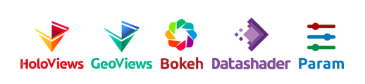
- HoloViews : Declarative objects for instantly visualizable data, building Bokeh plots from convenient high-level specifications
- GeoViews : Visualizable geographic data that that can be mixed and matched with HoloViews objects
- Bokeh : Interactive plotting in web browsers, running JavaScript but controlled by Python
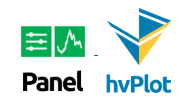
- Panel : Assembling objects from many different libraries into a layout or app, whether in a Jupyter notebook or in a standalone serveable dashboard
- Datashader : Rasterizing huge datasets quickly as fixed-size images
- hvPlot : Quickly return interactive HoloViews or GeoViews objects from your Pandas, Xarray, or other data structures
- Param : Declaring user-relevant parameters, making it simple to work with widgets inside and outside of a notebook context
Apart from this, PyViz core tools can work seamlessly with the following libraries.

Also, Objects from nearly every other plotting library can be used with Panel , including specific support for all those listed here plus anything that can generate HTML, PNG, or SVG. HoloViews also supports Plotly for 3D visualizations.
Resources
PyViz provides examples, demos and training materials documenting how to solve visualization problems. This tutorial provides starting points for solving your own visualization problems. The entire tutorial material is also hosted at their Github Repository.
Installation
Please consult pyviz.org for full instructions on installation of the software used in these tutorials. Here is the condensed version of those instructions, assuming you have already downloaded and installed Anaconda or Miniconda :
conda create -n pyviz-tutorial python=3.6
conda activate pyviz-tutorial
conda install -c pyviz/label/dev pyviz
pyviz examples
cd pyviz-examples
jupyter notebook
Once everything is installed, the following cell should print ‘1.11.0a4’ or later:
import holoviews as hv
hv.__version__
'1.11.0a11'
hv.extension('bokeh', 'matplotlib')
#should see the HoloViews, Bokeh, and Matplotlib logos
#Import necessary libraries
import pandas
import datashader
import dask
import geoviews
import bokeh
If it completes without errors your environment should be ready to go.
Exploring Data with PyViz
In this section, we will see how different libraries are effective in bringing out different insights from data and their conjunction can really help to analyse data in a better way.
Dataset
The dataset being used pertains to the number of cases of measles and pertussis recorded per, 100,000 people over time in each state of the US. The dataset comes pre-installed with the PyViz tutorial.
Data Exploration with Pandas
In any Data Science project, it is but natural to begin the exploration with pandas. Let us import and display the first few rows of our dataset.
import pandas as pd
diseases_data = pd.read_csv('../data/diseases.csv.gz')
diseases_data.head()

Numbers are good but a plot would give us a better idea about the patterns in the data.
Data Exploration with Matplotlib
%matplotlib inline
diseases_data.plot();
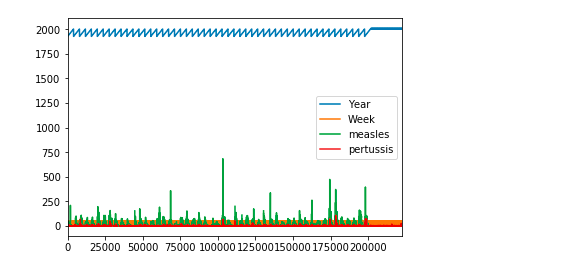
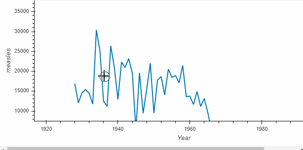
This doesn’t convey much. Let’s do some manipulations with pandas to get meaningful results.
import numpy as np
diseases_by_year = diseases_data[["Year","measles"]].groupby("Year").aggregate(np.sum)
diseases_by_year.plot();
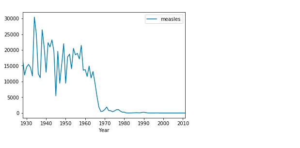
This makes much more sense. Here we can clearly infer that around 1970, something happened which brought down the rate of measles to almost nil. This is true since measles vaccines were introduced in the US around 1963 [Wikipedia]
Data Exploration with HVPlot and Bokeh
The plots above convey the right information but provide no interactivity. This is because they are static plots without the functionalities of the pan, hover or zoom in a web browser. However, we can achieve this interactive functionality by a mere import of the hvplot package.
import hvplot.pandas
diseases_by_year.hvplot()
What is returned by the call is called a HoloViews object (here Holoviews Curve)which displays as a Bokeh plot. Holoviews plots are much richer and make it easy to capture your understanding while exploring the data.
Let’s see what else can be done with HoloViews:
Capturing important points on the Plot itself
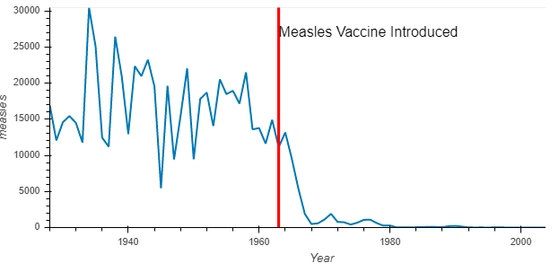
1963 was important with respect to measles and how about we record this point on the graph itself. This will also help us to compare the number of measles cases before and after the vaccine introduction.
import holoviews as hv
vline = hv.VLine(1963).options(color='red')
vaccination_introduced = diseases_by_year.hvplot() * vline * \
    hv.Text(1963, 27000, "Measles Vaccine Introduced", halign='left')
vaccination_introduced
Holoviews objects preserve the original data as opposed to other plotting libraries. For instance, it is possible to access the original data in tabular format.
print(vaccination_introduced)
vaccination_introduced.Curve.I.data.head()
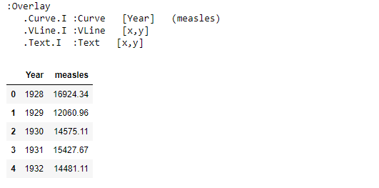
Here we were able to use the data that was used for making the plot. Also, it is now very easy to break data in many different ways.
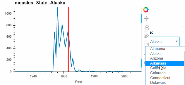
measles_agg = diseases_data.groupby(['Year', 'State'])['measles'].sum()
by_state = measles_agg.hvplot('Year', groupby='State', width=500, dynamic=False)
by_state * vline
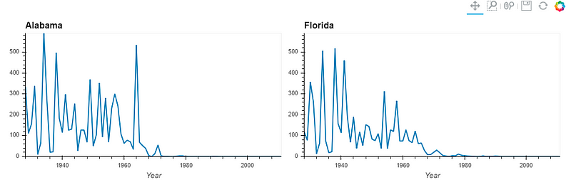
Instead of a dropdown, we can place charts side by side for better comparison.
by_state["Alabama"].relabel('Alabama') + by_state["Florida"].relabel('Florida')
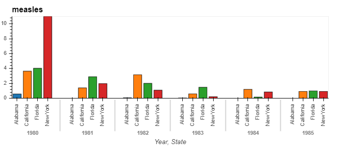
We can also change the type of plots, say to a bar chart. Let us compare the measles pattern from 1980 to 1985 across four states.
states = ['New York', 'Alabama', 'California', 'Florida']
measles_agg.loc[1980:1990, states].hvplot.bar('Year', by='State', rot=90)
It is quite evident from the examples above that by choosing HoloViews+Bokeh plots, we get the ability to explore data in our browser itself, with full interactivity and minimal code.
Visualising large datasets with PyViz
PyViz also enables working on very large datasets with ease. For such datasets, other members of PyViz suite come into the picture.
- GeoViews
- Datashader
- Panel
- Param
- Colorcet for perceptually uniform colormaps for big data
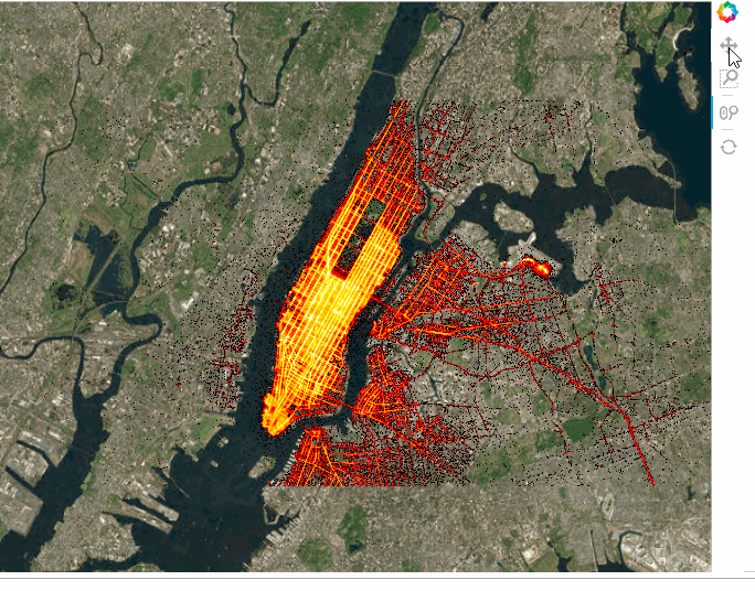
To show you the capabilities of these libraries when handling voluminous amount of data, let’s work with the NYC taxi dataset which consists of data pertaining to a whopping 10 million taxi trips. Again this data is already provided in the tutorial.
#Importing the necessary libraries
import dask.dataframe as dd, geoviews as gv, cartopy.crs as crs
from colorcet import fire
from holoviews.operation.datashader import datashade
from geoviews.tile_sources import EsriImagery
Dask is a flexible library for parallel computing in Python. A Dask DataFrame is a large parallel DataFrame composed of many smaller Pandas DataFrames, split along the index. These Pandas DataFrames may live on disk for larger-than-memory computing on a single machine, or on many different machines in a cluster. One Dask DataFrame operation triggers many operations on the constituent Pandas DataFrames.
Cartopy is a Python package designed for geospatial data processing in order to produce maps and other geospatial data analyses.
topts = dict(width=700, height=600, bgcolor='black', xaxis=None, yaxis=None, show_grid=False)
tiles = EsriImagery.clone(crs=crs.GOOGLE_MERCATOR).options(**topts)
dopts = dict(width=1000, height=600, x_sampling=0.5, y_sampling=0.5)
Reading in and plotting the data:
taxi  = dd.read_parquet('../data/nyc_taxi_wide.parq').persist()
pts   = hv.Points(taxi, ['pickup_x', 'pickup_y'])
trips = datashade(pts, cmap=fire, **dopts)
tiles * trips
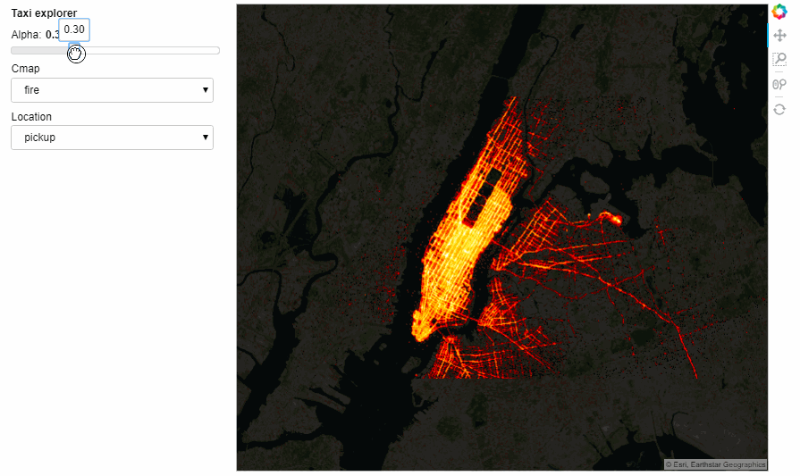
We can also add widgets to control the selections. This can be either done in the notebook or in a standalone server by marking the servable objects with .servable() then running the .ipynb file through Bokeh Server or extracting the code to a separate .py file and doing the same thing:
import param, panel as pn
from colorcet import palette
class NYCTaxi(param.Parameterized):
    alpha = param.Magnitude(default=0.75, doc="Map tile opacity")
    cmap = param.ObjectSelector('fire', objects=['fire','bgy','bgyw','bmy','gray','kbc'])
    location = param.ObjectSelector(default='dropoff', objects=['dropoff', 'pickup'])
    def make_view(self, **kwargs):
        pts   = hv.Points(taxi, [self.location+'_x', self.location+'_y'])
        trips = datashade(pts, cmap=palette[self.cmap], **dopts)
        return tiles.options(alpha=self.alpha) * trips
explorer = NYCTaxi(name="Taxi explorer")
pn.Row(explorer.param, explorer.make_view).servable()
Taxi explorer
The Notebook with all the running code can be accessed from here. However, the interactiveness does not render on GitHub but you can still access the notebook and run locally.
Conclusion
The PyViz tools help us to create beautiful visualisations even with a small amount of code. The PyViz tools bundle up together to build high-performance, scalable, flexible, and deployable visualizations, apps, and dashboards, without having to use JavaScript or other web technologies explicitly. This article is just a mere introduction to the multi useful PyViz ecosystem. Go through the entire tutorial to understand the intricacies and its usage for different types of data.
Bio: Parul Pandey is a Data Science enthusiast who frequently writes for Data Science publications such as Towards Data Science.
Original. Reposted with permission.
Related: