2018’s Top 7 R Packages for Data Science and AI
This is a list of the best packages that changed our lives this year, compiled from my weekly digests.
Editor's note: This post covers Favio's selections for the top 7 R packages of 2018. Yesterday's post covered his top 7 Python libraries of the year.

Introduction
If you follow me, you know that this year I started a series called Weekly Digest for Data Science and AI: Python & R, where I highlighted the best libraries, repos, packages, and tools that help us be better data scientists for all kinds of tasks.
The great folks at Heartbeat sponsored a lot of these digests, and they asked me to create a list of the best of the best—those libraries that really changed or improved the way we worked this year (and beyond).
If you want to read the past digests, take a look here:
Disclaimer: This list is based on the libraries and packages I reviewed in my personal newsletter. All of them were trending in one way or another among programmers, data scientists, and AI enthusiasts. Some of them were created before 2018, but if they were trending, they could be considered.
Top 7 for R

7. infer — An R package for tidyverse-friendly statistical inference
https://github.com/tidymodels/infer
Inference, or statistical inference, is the process of using data analysis to deduce properties of an underlying probability distribution.
The objective of this package is to perform statistical inference using an expressive statistical grammar that coheres with the tidyverse design framework.
Installation
To install the current stable version of infer from CRAN:
install.packages("infer")
Usage
Let’s try a simple example on the mtcars dataset to see what the library can do for us.
First, let’s overwrite mtcars so that the variables cyl, vs, am, gear, and carb are factors.
library(infer)
library(dplyr)
mtcars <- mtcars %>%
  mutate(cyl = factor(cyl),
         vs = factor(vs),
         am = factor(am),
         gear = factor(gear),
         carb = factor(carb))
# For reproducibility
set.seed(2018)
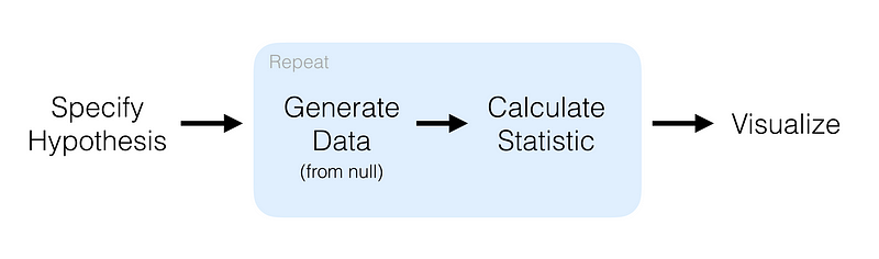
We’ll try hypothesis testing. Here, a hypothesis is proposed so that it’s testable on the basis of observing a process that’s modeled via a set of random variables. Normally, two statistical data sets are compared, or a data set obtained by sampling is compared against a synthetic data set from an idealized model.
mtcars %>%
  specify(response = mpg) %>% # formula alt: mpg ~ NULL
  hypothesize(null = "point", med = 26) %>%
  generate(reps = 100, type = "bootstrap") %>%
  calculate(stat = "median")
Here, we first specify the response and explanatory variables, then we declare a null hypothesis. After that, we generate resamples using bootstrap and finally calculate the median. The result of that code is:
## # A tibble: 100 x 2
##    replicate  stat
##        <int> <dbl>
##  1         1  26.6
##  2         2  25.1
##  3         3  25.2
##  4         4  24.7
##  5         5  24.6
##  6         6  25.8
##  7         7  24.7
##  8         8  25.6
##  9         9  25.0
## 10        10  25.1
## # ... with 90 more rows
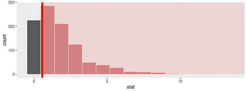
One of the greatest parts of this library is the visualize function. This will allow you to visualize the distribution of the simulation-based inferential statistics or the theoretical distribution (or both). For an example, let’s use the flights data set. First, let’s do some data preparation:
library(nycflights13)
library(dplyr)
library(ggplot2)
library(stringr)
library(infer)
set.seed(2017)
fli_small <- flights %>%
  na.omit() %>%
  sample_n(size = 500) %>%
  mutate(season = case_when(
    month %in% c(10:12, 1:3) ~ "winter",
    month %in% c(4:9) ~ "summer"
  )) %>%
  mutate(day_hour = case_when(
    between(hour, 1, 12) ~ "morning",
    between(hour, 13, 24) ~ "not morning"
  )) %>%
  select(arr_delay, dep_delay, season,
         day_hour, origin, carrier)
And now we can run a randomization approach to χ2-statistic:
chisq_null_distn <- fli_small %>%
  specify(origin ~ season) %>% # alt: response = origin, explanatory = season
  hypothesize(null = "independence") %>%
  generate(reps = 1000, type = "permute") %>%
  calculate(stat = "Chisq")
chisq_null_distn %>% visualize(obs_stat = obs_chisq, direction = "greater")
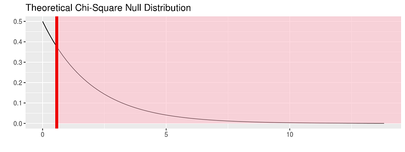
or see the theoretical distribution:
fli_small %>%
  specify(origin ~ season) %>%
  hypothesize(null = "independence") %>%
  # generate() ## Not used for theoretical
  calculate(stat = "Chisq") %>%
  visualize(method = "theoretical", obs_stat = obs_chisq, direction = "right")
For more on this package visit:
6. janitor — simple tools for data cleaning in R

https://github.com/sfirke/janitor
Data cleansing is a topic very close to me. I’ve been working with my team at Iron-AI to create a tool for Python called Optimus. You can see more about it here:
But this tool I’m showing you is a very cool package with simple functions for data cleaning.
It has three main functions:
- perfectly format
data.framecolumn names; - create and format frequency tables of one, two, or three variables (think an improved
table(); and - isolate partially-duplicate records.
Oh, and it’s a tidyverse-oriented package. Specifically, it works nicely with the %>% pipe and is optimized for cleaning data brought in with the readr and readxl packages.
Installation
install.packages("janitor")
Usage
I’m using the example from the repo, and the data dirty_data.xlsx.
library(pacman) # for loading packages
p_load(readxl, janitor, dplyr, here)

roster_raw <- read_excel(here("dirty_data.xlsx")) # available at http://github.com/sfirke/janitor
glimpse(roster_raw)
#> Observations: 13
#> Variables: 11
#> $ `First Name`        <chr> "Jason", "Jason", "Alicia", "Ada", "Desus", "Chien-Shiung", "Chien-Shiung", N...
#> $ `Last Name`         <chr> "Bourne", "Bourne", "Keys", "Lovelace", "Nice", "Wu", "Wu", NA, "Joyce", "Lam...
#> $ `Employee Status`   <chr> "Teacher", "Teacher", "Teacher", "Teacher", "Administration", "Teacher", "Tea...
#> $ Subject             <chr> "PE", "Drafting", "Music", NA, "Dean", "Physics", "Chemistry", NA, "English",...
#> $ `Hire Date`         <dbl> 39690, 39690, 37118, 27515, 41431, 11037, 11037, NA, 32994, 27919, 42221, 347...
#> $ `% Allocated`       <dbl> 0.75, 0.25, 1.00, 1.00, 1.00, 0.50, 0.50, NA, 0.50, 0.50, NA, NA, 0.80
#> $ `Full time?`        <chr> "Yes", "Yes", "Yes", "Yes", "Yes", "Yes", "Yes", NA, "No", "No", "No", "No", ...
#> $ `do not edit! --->` <lgl> NA, NA, NA, NA, NA, NA, NA, NA, NA, NA, NA, NA, NA
#> $ Certification       <chr> "Physical ed", "Physical ed", "Instr. music", "PENDING", "PENDING", "Science ...
#> $ Certification__1    <chr> "Theater", "Theater", "Vocal music", "Computers", NA, "Physics", "Physics", N...
#> $ Certification__2    <lgl> NA, NA, NA, NA, NA, NA, NA, NA, NA, NA, NA, NA, NA
With this:
roster <- roster_raw %>%
  clean_names() %>%
  remove_empty(c("rows", "cols")) %>%
  mutate(hire_date = excel_numeric_to_date(hire_date),
         cert = coalesce(certification, certification_1)) %>% # from dplyr
  select(-certification, -certification_1) # drop unwanted columns
With the clean_names() function, we’re telling R that we’re about to use janitor. Then we clean the empty rows and columns, and then using dplyr we change the format for the dates, create a new column with the information of certification and certification_1, and then drop them.
And with this piece of code…
roster %>% get_dupes(first_name, last_name)
we can find duplicated records that have the same name and last name.
The package also introduces the tabyl function that tabulates the data, like table but pipe-able, data.frame-based, and fully featured. For example:
roster %>%
  tabyl(subject)
#>     subject n    percent valid_percent
#>  Basketball 1 0.08333333           0.1
#>   Chemistry 1 0.08333333           0.1
#>        Dean 1 0.08333333           0.1
#>    Drafting 1 0.08333333           0.1
#>     English 2 0.16666667           0.2
#>       Music 1 0.08333333           0.1
#>          PE 1 0.08333333           0.1
#>     Physics 1 0.08333333           0.1
#>     Science 1 0.08333333           0.1
#>        <NA> 2 0.16666667            NA
You can do a lot more things with the package, so visit their site and give them some love :)
5. Esquisse — RStudio add-in to make plots with ggplot2

https://github.com/dreamRs/esquisse
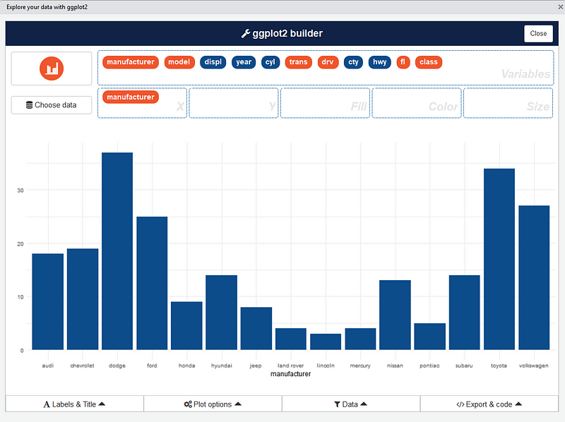
This add-in allows you to interactively explore your data by visualizing it with the ggplot2 package. It allows you to draw bar graphs, curves, scatter plots, and histograms, and then export the graph or retrieve the code generating the graph.
Installation
Install from CRAN with :
# From CRAN
install.packages("esquisse")
Usage
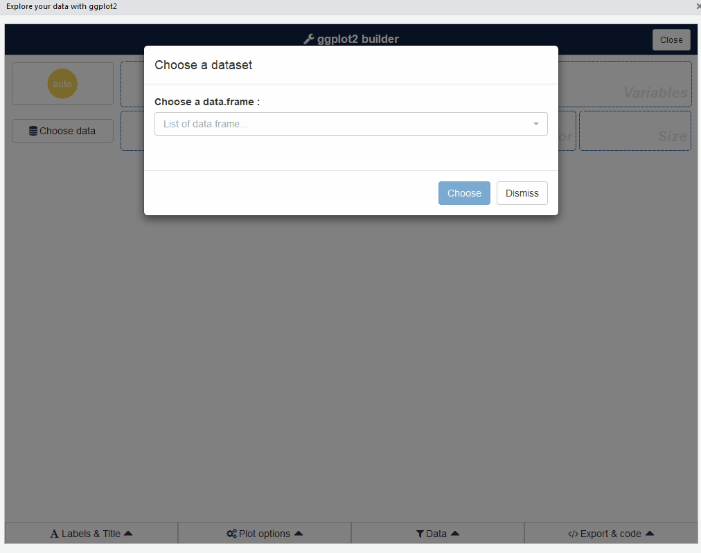
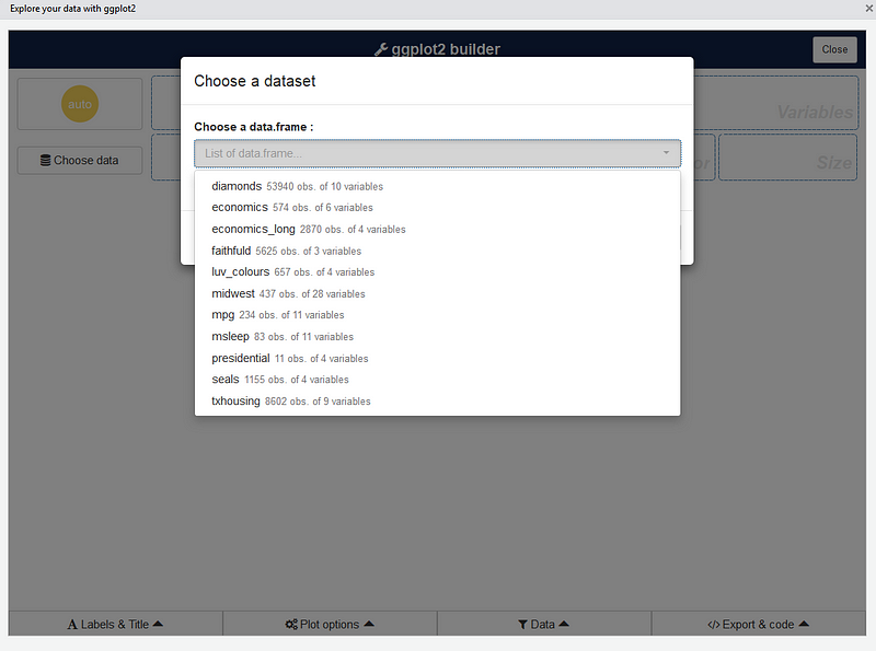
Then launch the add-in via the RStudio menu. If you don’t have data.framein your environment, datasets in ggplot2 are used.
ggplot2 builder addin
Launch the add-in via the RStudio menu or with:
esquisse::esquisser()
The first step is to choose a data.frame:
Or you can use a dataset directly with:
esquisse::esquisser(data = iris)
After that, you can drag and drop variables to create a plot:
You can find information about the package and sub-menus in the original repo: